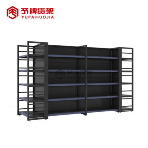
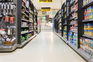
Supermarkets are competing for our attention, and the layout of their shelves is a huge part of that competition. When supermarkets were first invented, they stocked a set number of items on supermarket shelves in one long row. Over time, it became clear that this design didn’t work so well; people would have to walk the entire length of the store to find whatever they needed. That gave them more time to look at all the other products, which was bad for sales! So stores switched to the modern design of having multiple aisles in which shoppers can find what they need quickly and efficiently.
Introduction
The supermarket is a place where we are bombarded with choices. From the moment we walk in, we are faced with an array of products, all vying for our attention.
It can be overwhelming, but have you ever stopped to wonder why the supermarket shelves are designed the way they are? It turns out, there is a lot of psychology behind it.
For starters, supermarkets use what is known as the “rule of thirds” when it comes to shelving. This means that items are placed in such a way that they are grouped into threes.
Why? Because studies have shown that our brains process information more efficiently when it is presented this way. We are able to take in and understand more information when it is chunked into manageable chunks.
In addition, supermarkets often place the most popular items at eye level, because they know that these are the products that people are most likely to purchase. If you’ve ever noticed that the cereal aisle always has the most exciting displays at eye level, now you know why!
Lastly, supermarkets use a technique called “loss aversion” to get us to spend more money. This means that they place items that we perceive as being of high value (like steak or lobster) at the end of aisles, so that we have to walk past all of the other tempting items to get to them. This tricks our brains into thinking that we will be losing out if we
Why supermarket shelves are designed the way they are
supermarket shelves are designed to influence our behavior in several ways. For example, they are often placed at eye level to make it more likely that we’ll see and purchase the items on them. Additionally, they are often brightly lit and arranged in a way that makes it easy for us to find what we’re looking for.
All of these design elements are meant to encourage us to buy more items while we’re at the store. By making it easier for us to find what we want and by making the items on the supermarket shelves more visible, supermarkets are able to increase their sales and profits.
-
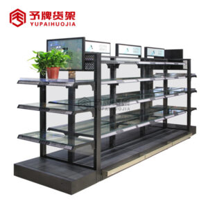
 Steel stationery shop display rack for sale
 -
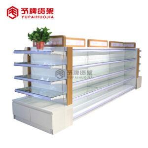
 Supermarket shelves for sale in dubai
 -
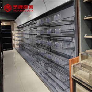
 Pharmacy grocery display for sale
 -
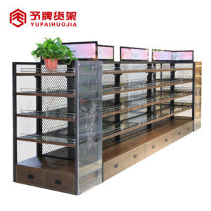
 Cosmetic display shelves for shop
 -
 wholesale cosmetic display rack
 -
 Supermarket Cosmetics shelves supplier
 -
 kitchenware store shelves for sale
 -
 Adjustable Steel Modern Shelf Steel Shelves Grocery Shelf Mini Store
 -
 4 post retail shop racking display grocery item display rack supermarket shelf gondola
Marketing tactics used by supermarkets to influence sales
Product placement is one of the most common marketing tactics used by supermarkets to influence sales. By strategically placing certain products in highly visible locations, supermarkets are able to increase the chances that customers will notice and purchase those items.
Another common marketing tactic used by supermarkets is called loss leader pricing. This involves pricing a few select items at very low prices in order to lure customers into the store with the promise of great deals. Once inside, customers are then more likely to purchase other items that may be priced higher than they would ordinarily pay.
Supermarkets also use a variety of in-store promotions and discounts to influence sales. For example, they may offer temporary price reductions on certain items, or run “buy one, get one free” deals. These promotions can be very effective in getting customers to purchase items that they may not have otherwise considered.
Finally, supermarkets often use psychological tricks to influence customer behavior. For instance, they may play slow, relaxing music throughout the store to encourage shoppers to linger and look at more products. Or they may place impulse buys like candy and magazines near the checkout line to tempt customers into making last-minute purchases.
How to arrange supermarket shelves for better sales
The supermarket is a carefully designed space, and the layout of the supermarket shelves plays a big role in how customers interact with the products on display. By understanding the psychology behind why supermarket shelves are designed the way they are, retailers can make better decisions about how to arrange their shelves for better sales.
One of the most important considerations in shelf design is eye level placement. Products that are placed at eye level are more likely to be noticed and purchased than those that are not. This is because our eyes are drawn to objects at our eye level first, and then we scan downwards from there. Therefore, it is important to place your best-selling or most popular products at eye level, where they will be sure to catch customers’ attention.
Another important consideration is called the “golden triangle.” This refers to the area of the supermarket shelves that is most visible and accessible to customers. The products in this area are more likely to be seen and purchased than those that are not in this prime location. Therefore, it is important to place your most popular products in this area of the store for maximum impact.
Finally, it is also important to consider color when arranging supermarket shelves. Certain colors can attract attention and influence customer behavior. For example, red is a color that has been shown to increase impulse buys. Therefore, if you want to increase sales of certain items, you may want to consider placing them on red shelves or using red signage to draw attention to them.
Conclusion
After reading this article, you now know the psychology behind why supermarket shelves are designed the way they are. The next time you’re grocery shopping, take a look around and see how these principles are at work. And the next time you’re designing a space, keep these ideas in mind to engage customers and encourage them to buy more. Thanks for reading!


